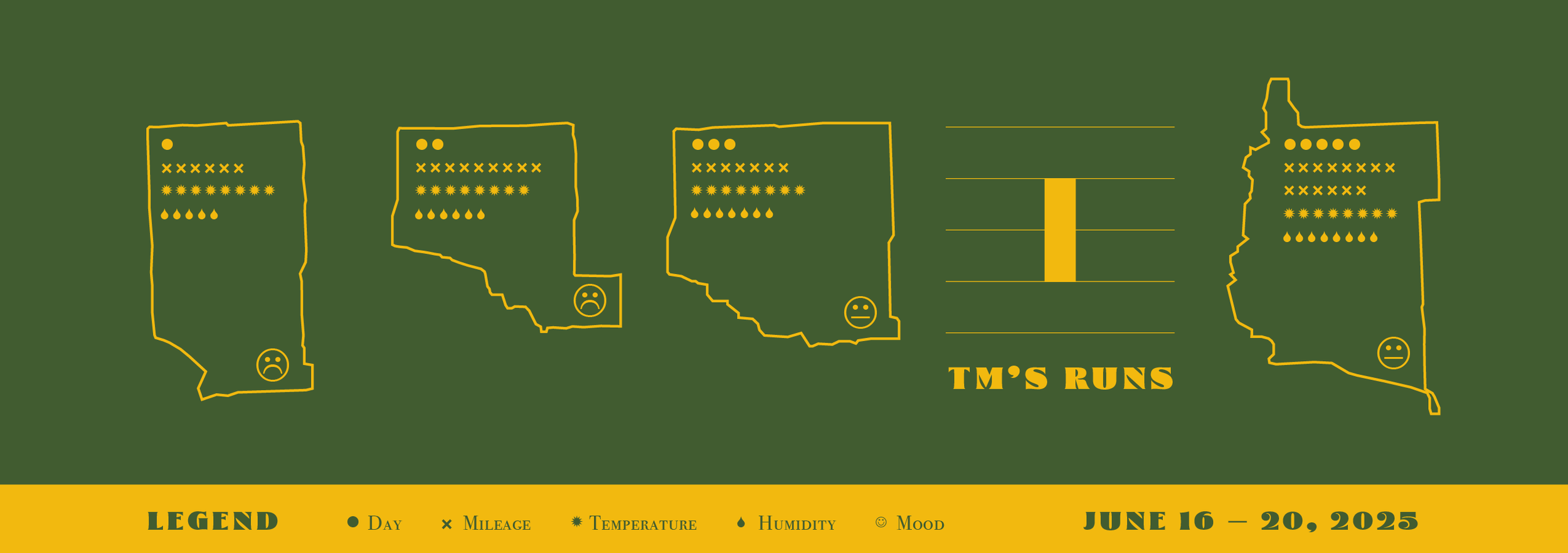
Data Loop
In January, Denise suggested that, since I am such a collector/connoisseur of personal data, I should make a data visualization project for one of my graphics courses. When I admitted I didn’t know what this was, she introduced me to a fascinating world of creative people representing data sets in the most unique ways. I was particularly bowled over by Nicholas Felton’s Feltron Reports and Giorgia Lupi and Stefanie Posavec’s irrisistably charming Dear Data project.
I never got around to making one in class, but found myself thinking about data visualization again this week. I’m about eight weeks into my training schedule for the Marquette Marathon and the running data is really piling up. It seemed like an easy entry with plenty of data points to choose from. This was a particularly beastly week of heat and humidity, so I focused largely on the conditions (heat, humidity, mood) of my runs, while using my route maps as the building blocks of the design. The green and yellow color palette is widely used around Marquette as NMU’s school colors, on Blackrocks 51K IPA cans, and as branding for the marathon itself.
Lastly, the title, Data Loop, is a nod to my dad. In addition to accurately describing this visualization, it was also the name of the one-man sales firm he ran out of a little office in downtown Brighton when I was young. I desperately wish I still had a Data Loop pen, some stationary, or one of those handy little two-sided screwdrivers he had in his sales kit. I realize now that these formed my first impressions of branding.

